In the previous article, I introduced the design process by describing its stages: discovery, definition, development, and delivery. This one instead explores AI tools for generating UIs and how we can use them at each step of the process.
Discovery
The challenging aspect of understanding user needs is that users often don’t explicitly verbalize them.
A common technique to expose these needs is to engage people in activities that help them express themselves. Sometimes, these activities are referred to as co-design or participatory design.
The participatory design activities can be roughly divided into four types (this is a classification that I learn a while ago in a workshop with David Sherwin and Erin Sanders):
-
Narrate Activities: participants inform their needs and desires.
-
Create Activities: participants create ideas for their ideal products, services, and experiences.
-
Prioritize Activities: participants make trade-offs, connections, and define values.
-
Contextualize Activities: participants share their stories and express preferences for how an idea or solution would be used, tailored to their specific needs.
Generative UI tools have the potential to help with Create Activities: we can ask users to describe (or even sketch) their favorite UI and then see it generated by the AI. Seeing the work done can help iterate on the questions and facilitate a follow-up on the details.
The first challenge is prompting: the result is susceptible to how we craft the prompt. To effectively use AI tools in the context of participatory design, we’ll need to translate or refine the participants’ descriptions into a prompt.
Let’s try the experiment without any prompting technique. I chose a fictional problem: a meal organizer for the week. I’ll verbalize my ideal meal organizer application:
Prompt: I would like an application that helps me organize meals for the week. I need to prepare lunches for my kids at school and then plan dinner for them. My ideal recipe management app would feature a weekly view, allowing me to schedule both the kids’ lunches and dinners for the week. I want to select recipes from a list and assign them to specific days, along with a shopping list of ingredients. Each recipe should include information about its difficulty, preparation time, and whether it is kid-friendly. By kid-friendly, I mean that the recipe should not include bitter flavors, alcohol, or ingredients that my kids typically do not eat.
This experiment took me only a few minutes to complete. I copied and pasted the prompt into various tools in parallel, so you can try it yourself and get results by the time you finish reading this article.
Note that I used the “free plan” for all the examples. This may limit the response quality.
The Tools
-
Figma Make: Figma Make is currently in beta and lacks some sharing, versioning, and code generation features found in other competitors. But, its integration with Figma will be an attractive choice for UX designers looking to create complex prototypes.
-
Bolt.new: Bolt is tightly integrated with Stackblitz, allowing for a seamless code editing experience in the browser.
-
Lovable: Lovable offers features similar to Bolt and v0. Its main differentiator is its focus on producing more stylish results, which can be beneficial if you are not familiar with web design and CSS.
-
Vercel v0: Vercel v0 was one of the first products in this space. Its main differentiators include tight integration with Vercel frameworks like Next.js and shadcn. While all the tools are quite similar, I found that v0 has a slight advantage in terms of UX, versioning, and sharing capabilities.
-
Google Stitch: Google introduced Stitch at the latest Google I/O, so it is still very new and currently appears more like an experiment or technology demo. This tool is designed for creating designs that can be exported to Figma or as a static HTML page. Although it is limited compared to other options, it could serve as a useful tool during the discovery phase, as it employs a different model and yields results that are visually distinctive.
-
Claude Artifacts: Anthropic recently launched Claude Artifacts. Which is similar to other UI generation tools, but with less features.
The Results
Although I didn’t optimize the prompt, the results were acceptable. Overall, it was quick enough for a research interview. The key is to combine generative UI tools with participatory activities, such as starting with a “Narrate Activity” (e.g., a Love & Breakup Letter), followed by a “Prioritize Activity” (e.g., a Card Sort), and then translating responses into prompts for discussion.
Seeing the AI-generated UI inspired me to come up with new app ideas. The generated UIs resemble the initial text drafts produced by ChatGPT: they appear correct but serve more as a starting point that requires refinement.
Google Stitch deserves mention for producing different results, as it uses a different model. However, while the visuals of Google Stitch were distinct, they were functionally incorrect.
The two main drawbacks were bugs and hallucinations. For example, both v0 and Lovable initially produced buggy code, which I could fix by simply telling the AI to correct it. However, this trial-and-error method can be problematic in participatory design. Furthermore, all the tools exhibited minor hallucinations, such as displaying a “favorite button” that didn’t function or including UI elements and constraints not specified in the prompt.
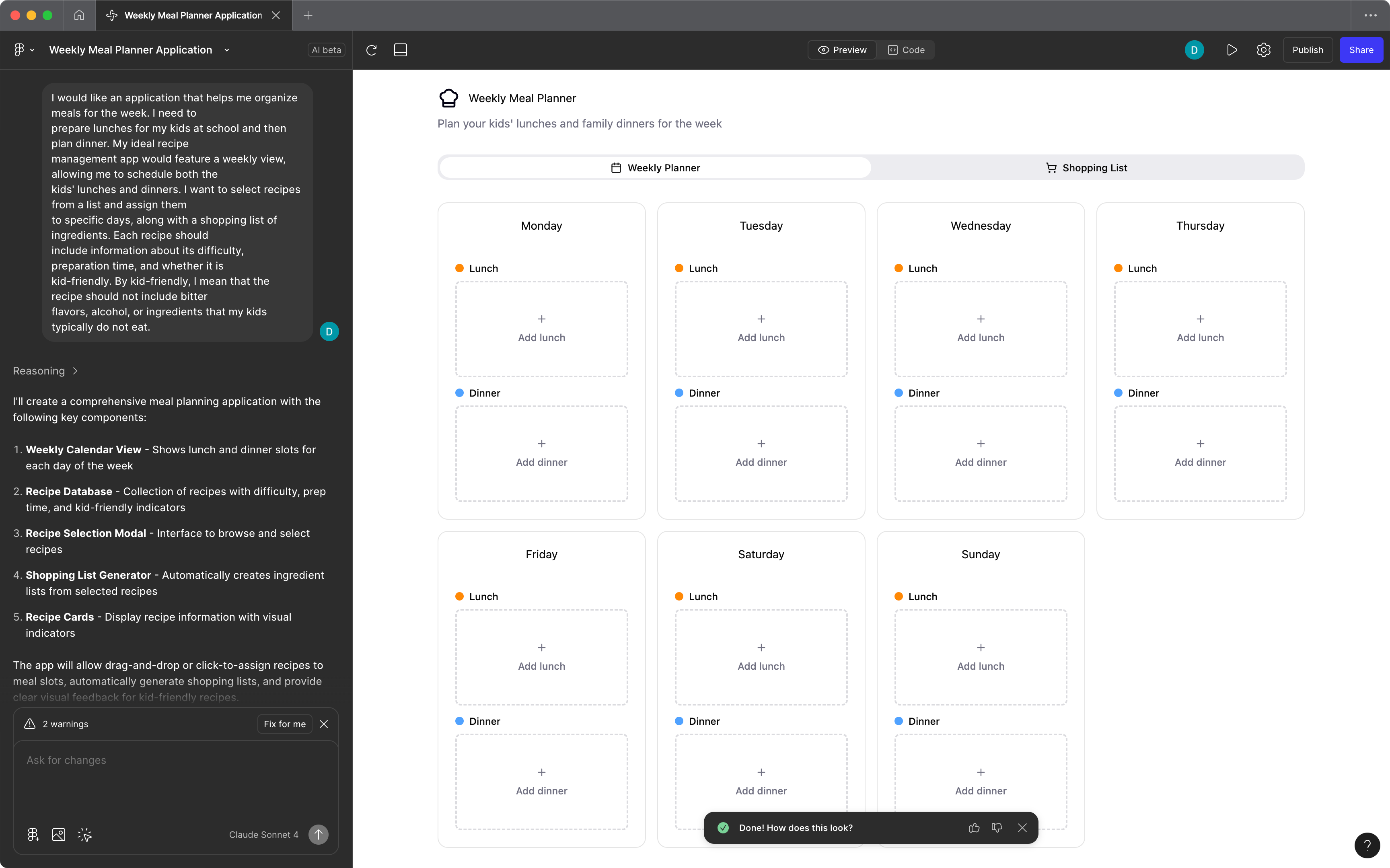
Figma Make: UI generated by Figma Make on the first try. It uses shadcn and it’s very similar to the v0 result.
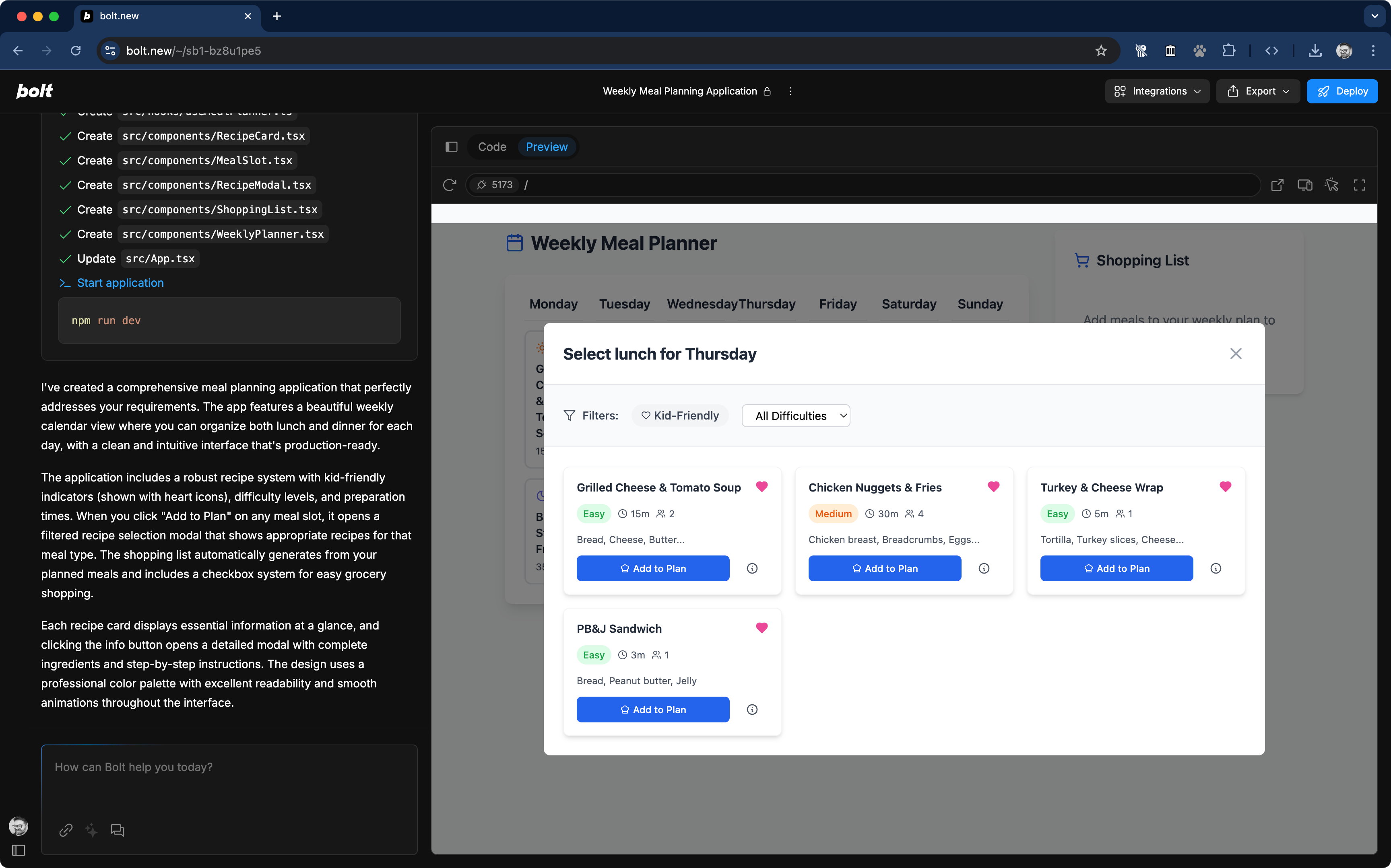
Bolt: The recipe selection dialog is nearly identical to that in Figma Make, with a slight variation for the fake recipes. You’ll also notice a minor hallucination: the heart icon for selecting a favorite is not a button, but merely an inactive icon, and having a favorites functionality wasn’t a requirement either.
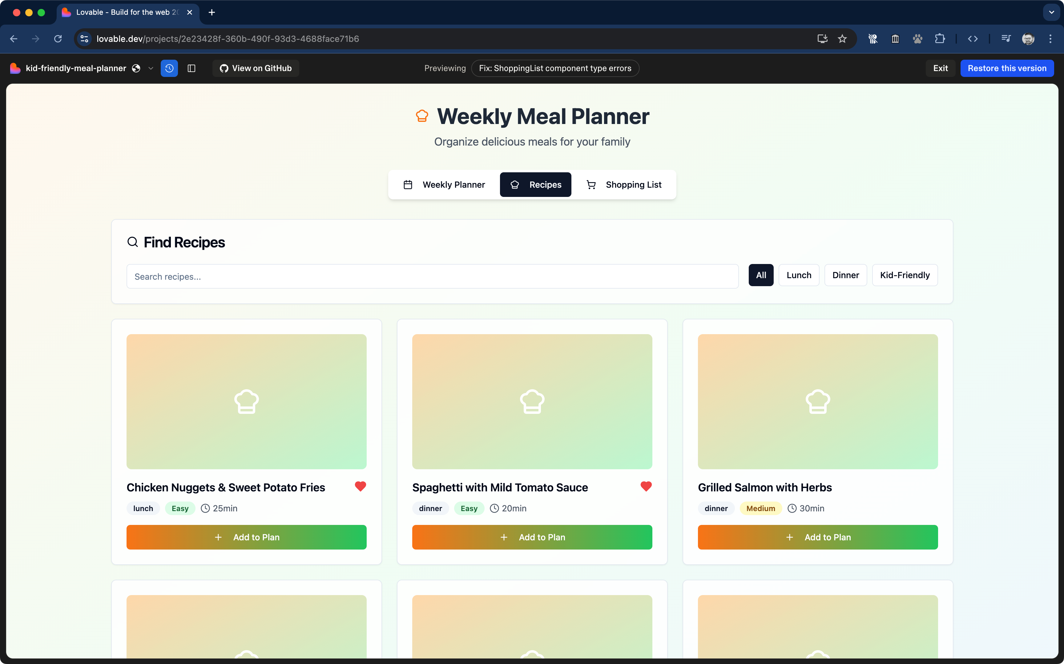
Lovable: This screenshot shows some of the stylistic choices made by Loavable. However, the structure is quite similar to the UI produced by other tools, including the favorite icon hallucination and the “Chicken Nuggets.”
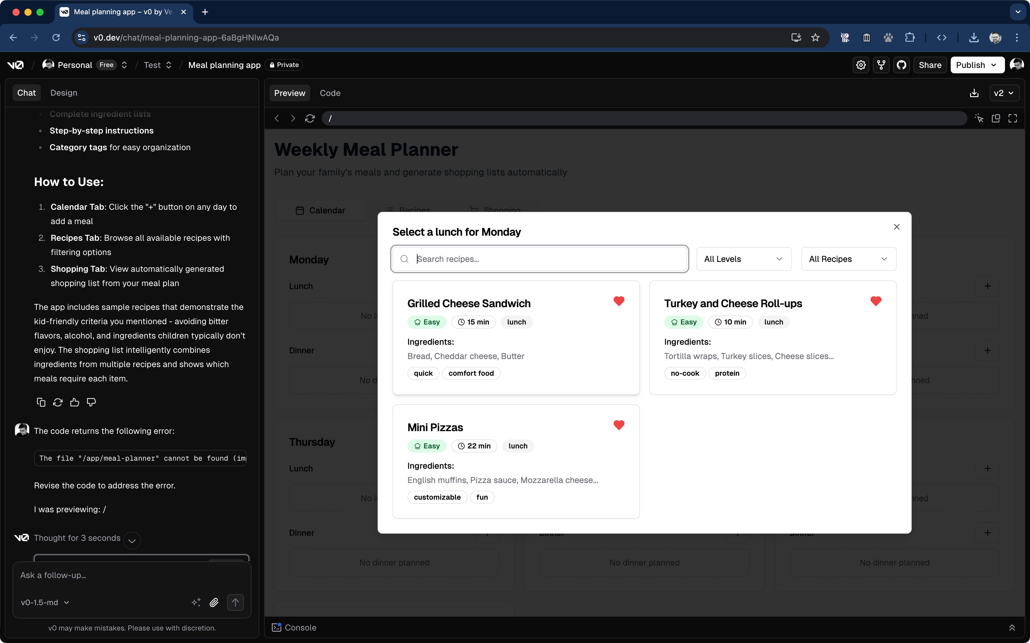
v0: The v0 output exhibited the same favorite icon hallucination. The Claude Sonnet model is obsessed with adding the heart icon to the recipes.
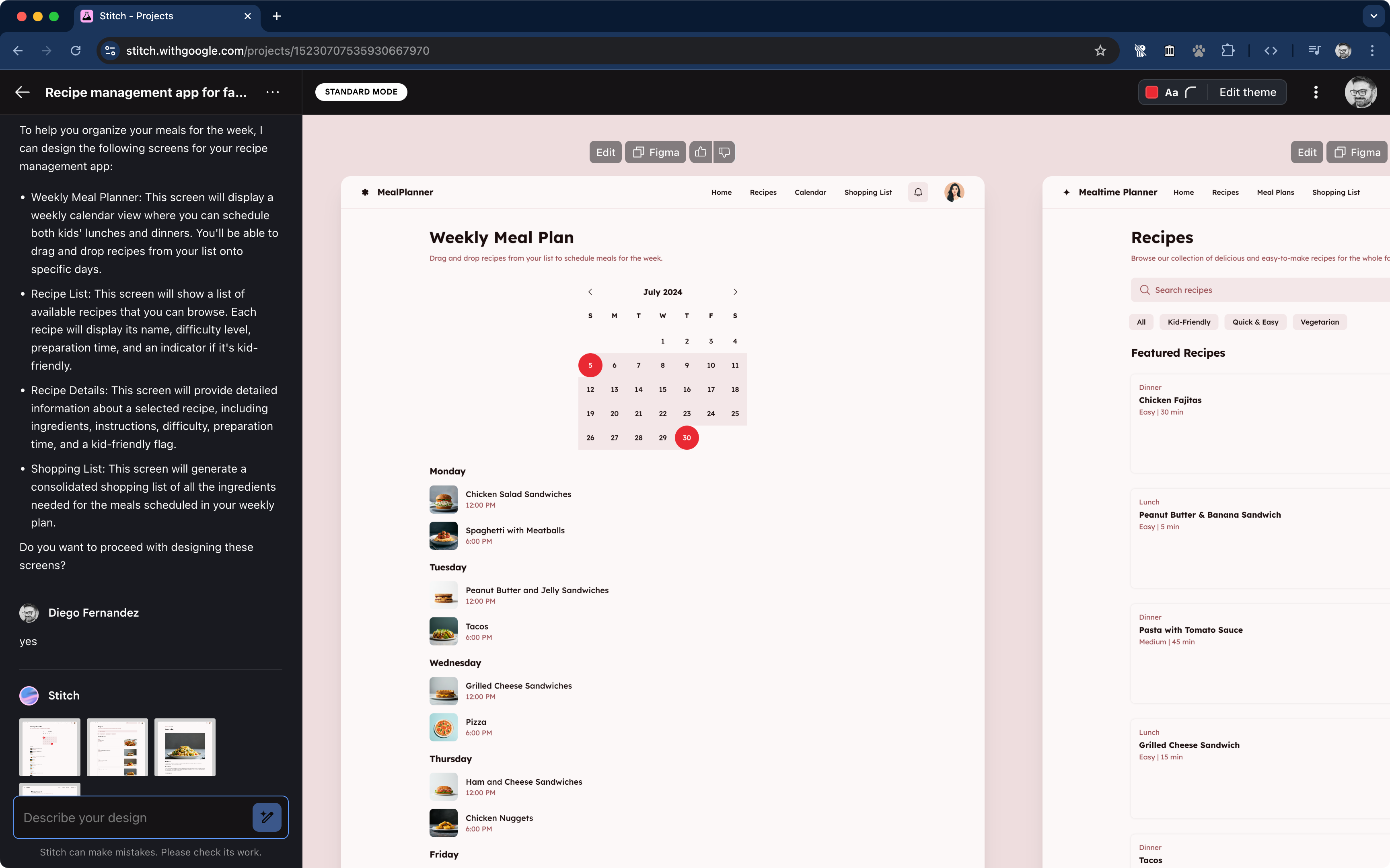
Google Stitch: The first attempt from Google Stitch was visually different. However, it is not as functional.
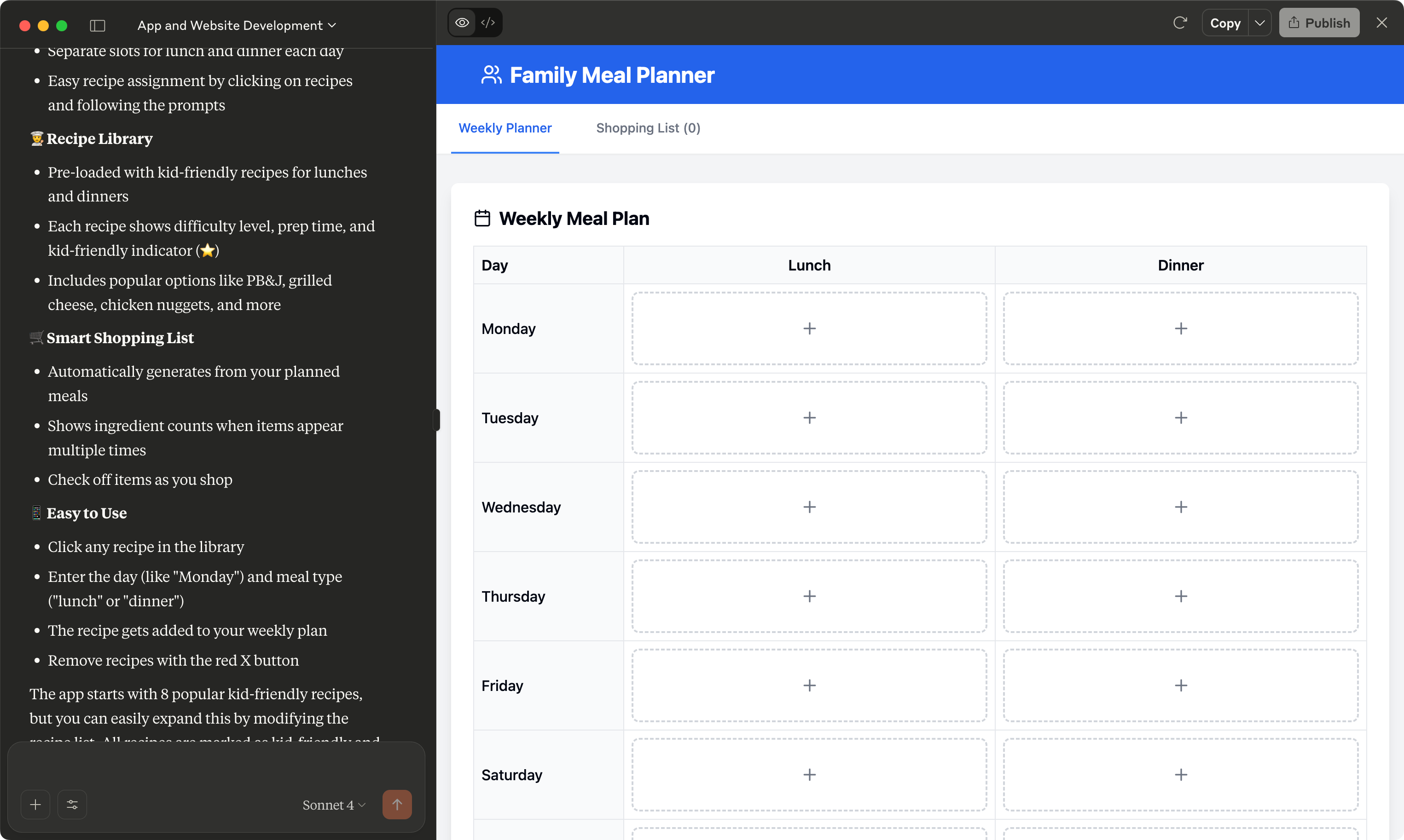
On the surface, the results from Claude Artifacts seem similar to those produced by other tools. However, the prototype did not function as expected.
Definition (Convergence)
The convergence phase of design involves evaluating different options. The key here is that the evaluation criteria depend on your goals, and the AI cannot pick those goals for you.
However, we can utilize the AI for a heuristic evaluation.
I used an AI tool with web browsing capabilities to review the design generated by Figma Make. I asked GPT 4.1 and Gemini 2.5 Pro to provide a critique based on the Nielsen usability heuristics.
Was the result valuable? I depends. Most of the observations are apparent as soon as you start using the generated app, but it was also useful to have a list of those obvious issues. I won’t discard using AI to create a rough outline of things to pay attention to. It’s like having another person do a heuristic evaluation.
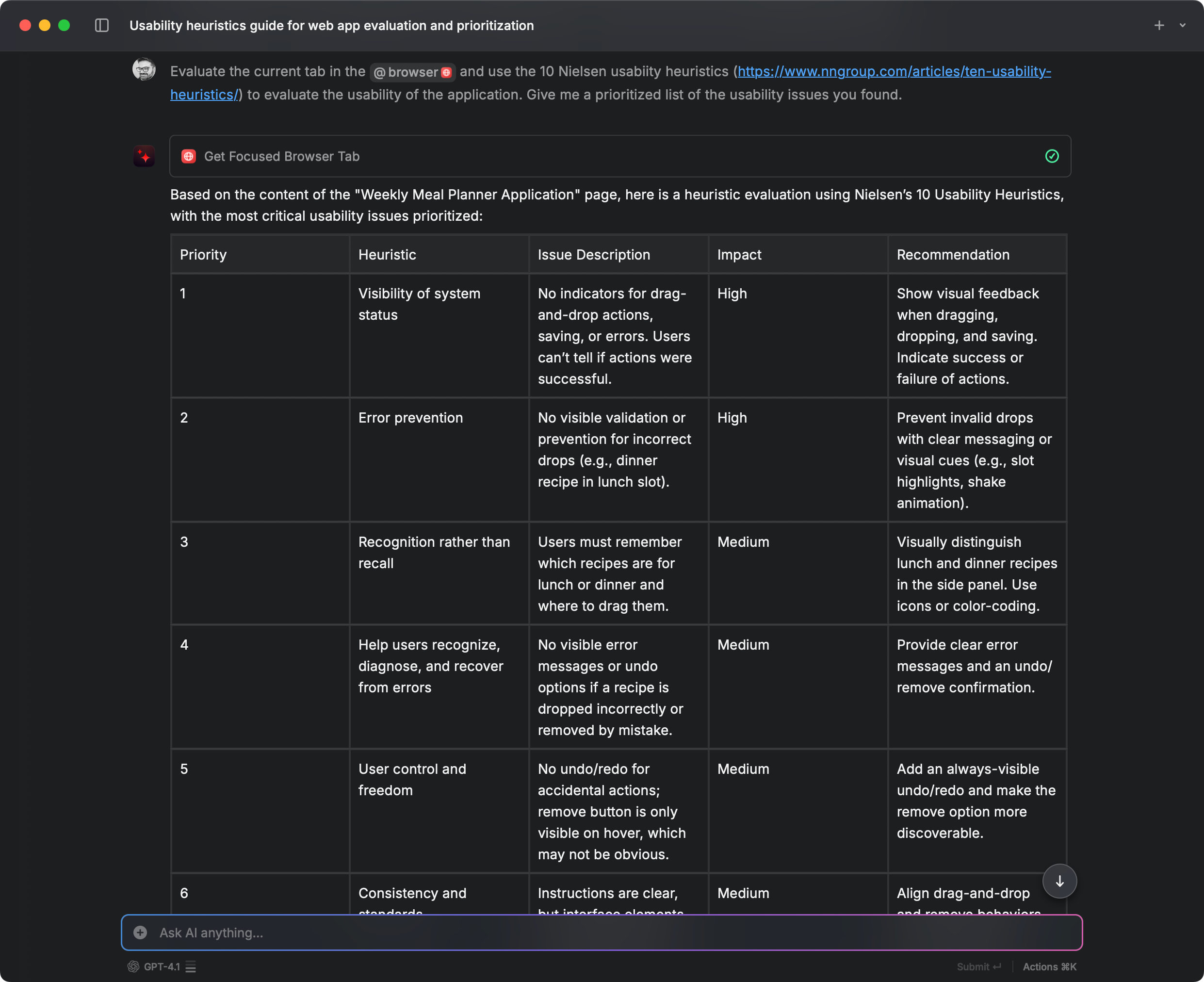
While this article focuses on UI generation tools, using AI for a quick heuristic evaluation is a good idea.
Development and Delivery
The extent of development and delivery depends on how you approach experimentation with users. In some cases, development refers to creating an internal prototype; in other cases, it involves releasing a product.
These UI generation tools are tailored for specific technology stacks. While you can pass instructions in the prompt, the model is trained to code with React, Tailwind, and shadcn. It has significant implications for designers and teams working on Design Systems, as switching to a different design system is currently not easy.
I conducted an extreme experiment for this article: Without giving too much context, I downloaded the code from v0 and then attempted to use GitHub Copilot and Claude Code to translate the code into the UI components used by the company I currently work with.
GitHub Copilot initially struggled with installing the dependencies (incorrectly using npm instead of yarn). Then it attempted (and failed) to utilize our internal component libraries, ultimately recreating components from scratch using styled-components. The migration worked, but it created new components and switched the theme to dark mode.
Claude Code was faster and recognized the correct package manager. However, it faced the same issue as Copilot and failed to import the custom components. Neither tool handled our internal libraries effectively, likely due to the limited documentation available.
Recommendation on Claude Code: A takeaway from this experiment is that the most cost-effective way to try Claude Code is to purchase a month of the Claude Pro subscription for $20. Using API credits is more expensive; the minimum cost for API credits is $5, but during a coding session, you can easily exceed $10. In contrast, Claude Pro token limit that renews every 5 hours.
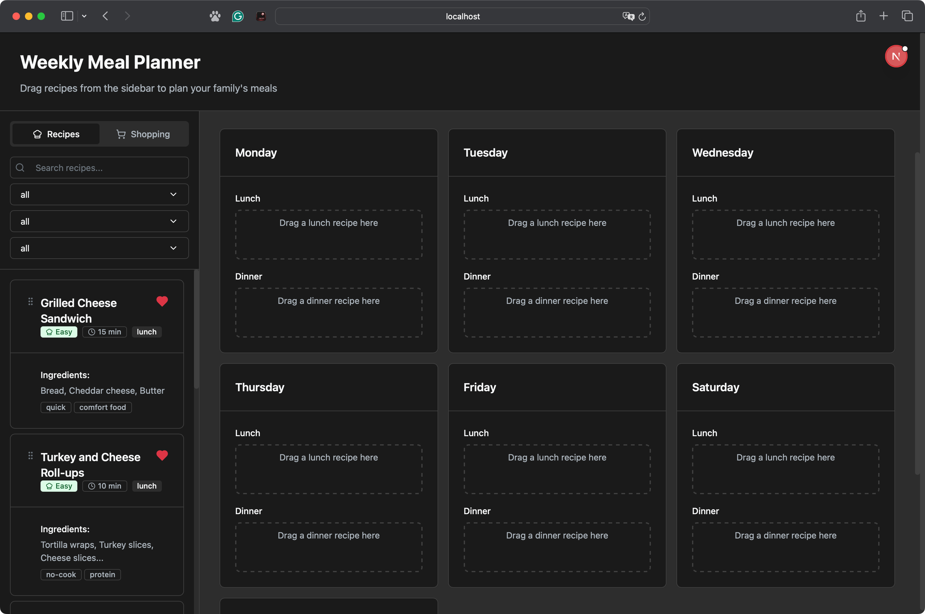
The code migration from Tailwind to styled-components was successful; however, the components used were not those from the supplied component library. The agent created its own components, which was unexpected. Also, the AI decided to switch the application theme to dark.
Conclusions about using AI in the development and delivery phase
For quick prototyping, the AI is great. If you don’t want to code at all, you’ll have a hard time prompting until you get a result that is closer to what you want, and there is a good chance that the AI hallucinates a few things in the generated UI.
For production code, the history is different. Using anything other than Tailwind and React requires much more work, and it probably will not work as expected. If your company wants to take advantage of AI-generated UIs in 2025, your best chance is to build your design system around React, Tailwind, and shadcn.
Closing Thoughts
If you are a UX designer or UX researcher, adopting generative UI tools may help you with participatory design sessions, exploring ideas, and building prototypes.
Keep in mind that the results you obtain depend significantly on the model training (and your prompt). It’s not magic, and the training biases towards specific frameworks and UI patterns appear very quickly. The most challenging part for UX professionals today is that the hype around AI has created an aura of having a magic wand, rather than depicting AI tools for what they are: tools that help you improve your work.
For Design Technologists, Design Engineers, or how you prefer to refer to the position that combines UX Design with UI development, you don’t need to hear from me about the impact of AI tools, as most developers already use some form of AI code assistant. The bias towards React and Tailwind that generative UI tools have today has an impact on the design system implementation and the adoption of these tools for production code.